Headhunted — Website UI & Frontend Design
UI and frontend-ready design for Headhunted — a nonprofit supporting education and aid programs for children, single mothers, and individuals in need. The goal: a website that makes the mission immediately legible, builds trust without friction, and delivers a component system clean enough to maintain and extend.
Overview
Headhunted needed more than a website — it needed a credibility system. Nonprofits live or die on trust signals: visitors decide within seconds whether an organization is legitimate, focused, and worth their attention or donation. The design challenge wasn't visual complexity — it was clarity under constraint: limited content, no established brand equity, and an audience that includes skeptical first-time visitors alongside returning supporters.
I owned end-to-end: brand direction, information architecture, UI system, component documentation, and design QA through implementation — working in close collaboration with Smarttie, the development partner.
Research & Discovery
Before any visual work, the discovery phase mapped the audiences and their intents — the two most important inputs for IA decisions on a mission-driven site. Four distinct user intents emerged:
- Learn: first-time visitors needing to quickly understand what Headhunted does and who it helps.
- Trust: potential donors or partners evaluating legitimacy, impact evidence, and organizational credibility.
- Participate: people looking for specific programs, ways to volunteer, or how to refer someone.
- Contact: users with a specific ask — needing a clear, low-friction path to reach the organization.
I reviewed a benchmark set of nonprofit websites — screening for content patterns that correlated with trustworthiness perception: impact numbers, beneficiary storytelling, organizational transparency, and navigational clarity. The findings directly informed the page hierarchy and what content appeared above the fold on each template.
Brand Direction
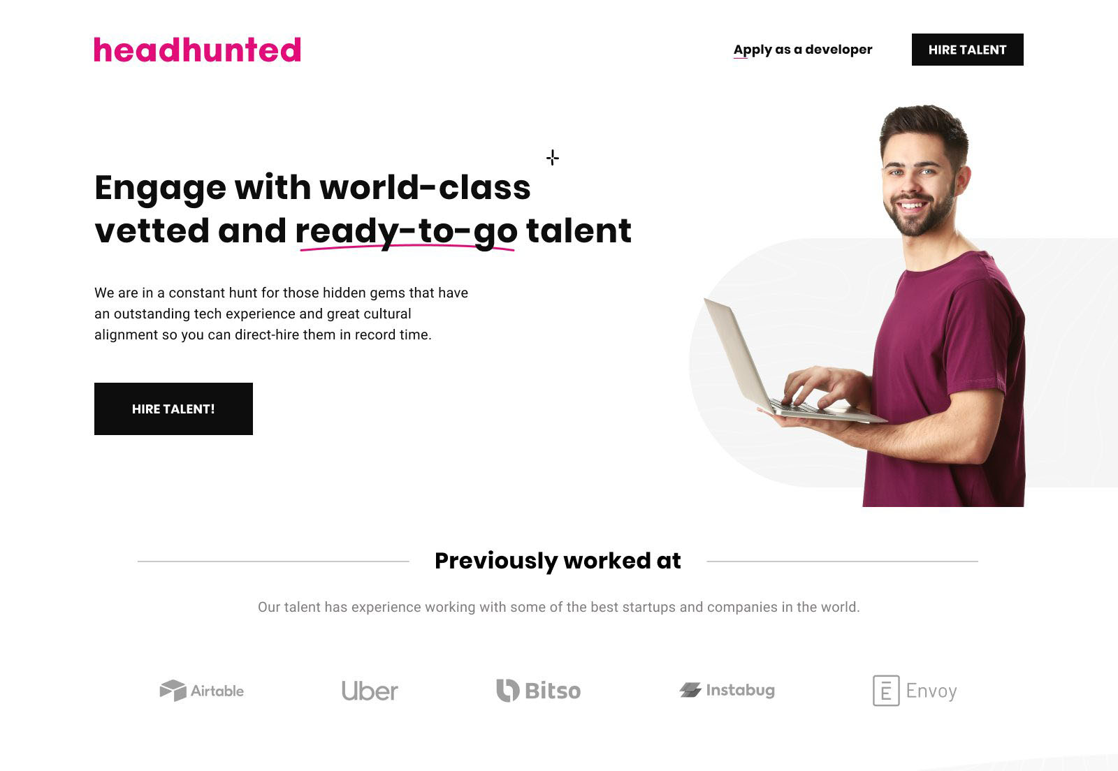
The brand system was built for warmth and precision in equal measure — avoiding the visual clichés of nonprofit design (heavy stock photography, primary-color palettes, motivational-poster typography) while still feeling approachable and mission-driven.
Typography decisions were made explicitly rather than intuitively. The type scale uses a modular ratio to create clear visual hierarchy across heading levels — ensuring users can scan the page structure without reading every word. Line-height values were set to 1.6–1.75 across body text to support readability for users with dyslexia or reading fatigue. Font weight progression (400 → 500 → 600) replaces size inflation as the primary differentiator between content levels, keeping the system legible at all viewport sizes without overscaling.
Color usage was intentionally restrained: a primary action color applied to interactive elements only, a neutral surface palette that lets photography and content carry emotional weight, and a secondary accent reserved for impact numbers and pull quotes — not decorative use.
UI Design & Component System
I built the UI as a component system rather than a collection of pages — ensuring that every pattern had a reusable structure, defined states, and documented behavior before being handed to developers. Even at this scale, treating the UI as a system rather than a set of one-off screens prevents implementation divergence and makes future content updates maintainable without a designer in the loop.
The component inventory covered: navigation (desktop + mobile), hero templates, program cards, testimonial blocks, stats/impact row, form (contact + referral), footer, and a CTA section in two variants. Each component was documented with spacing values, responsive behavior at three breakpoints, and interaction states (default, hover, focus, error).
- Responsive layouts: three-breakpoint system (mobile, tablet, desktop) with explicit column and spacing rules for each.
- Interactive states: every clickable and focusable element has a defined focus ring — not relying on browser defaults, which fail contrast requirements in most browsers.
- Error handling: form validation states designed inline (not modal or toast-only) to keep users in context and reduce abandonment.
- Semantic HTML in annotations: handoff documents specified heading level, landmark roles, and ARIA labels — not just visual styling — so implementation produced accessible markup by default.
Responsive Implementation — Desktop & Mobile
The component system rendered live across contexts — desktop at 1440px and iOS Safari at mobile breakpoint. Same codebase, different viewport: the three-breakpoint responsive system is observable in production, not theoretical in the spec. Every spacing value, font-weight step, and focus ring designed in Figma is now executing in HTML and CSS.
Accessibility
For a nonprofit audience, accessibility is not optional — it directly affects whether the people the organization serves can actually use the site. The design was evaluated against WCAG 2.1 AA throughout, with specific attention to:
- Color contrast: all text/background combinations verified at 4.5:1 for body text, 3:1 for large text and UI components. The restrained palette made this straightforward — no decorative color use that might create unexpected failures.
- Focus visibility: custom focus styles on all interactive elements — buttons, links, form fields — with a 3px offset ring that meets the new WCAG 2.2 focus appearance guidance.
- Form accessibility: all inputs use visible labels (not placeholder-only), with error messages that describe what went wrong and how to fix it — not just that something failed.
- Heading structure: H1–H3 hierarchy validated across every template to support screen reader navigation and logical reading order.
- Touch target sizing: all interactive elements meet the 44×44px minimum for mobile users — critical for users accessing via older devices or with motor impairment.
Developer Collaboration & Handoff
Working with Smarttie, I structured the handoff to eliminate ambiguity — the most common source of implementation drift. Rather than delivering a static Figma file and a hope, the handoff package included:
- Named component library with consistent naming conventions matching what developers would use in their codebase.
- Spacing and sizing in both px and rem — ensuring developers could implement relative sizing correctly for accessibility (respecting user font size preferences).
- Interaction annotations specifying transition duration, easing, and trigger conditions for hover, focus, and active states.
- ARIA and semantic markup notes embedded in component annotations — heading levels, landmark roles, alt text guidelines, and button vs. link usage rules.
I ran two rounds of design QA during implementation: one mid-build to catch early drift, and one pre-launch to validate cross-browser and cross-device consistency. The QA sessions produced a tracked issue list — not verbal feedback — so fixes were verifiable.
Outcome
The delivered website gives Headhunted a credible, maintainable presence that supports community awareness, program discovery, and direct contact — across devices and user contexts. The component system is documented to the level where future content updates or new pages can be built by the development team without requiring a designer to intervene for every change.
If extended, the next phase would introduce lightweight behavioral analytics — scroll depth, CTA click rates, and form completion funnels — to validate content engagement assumptions made during discovery and refine the calls to action based on observed behavior rather than intent mapping alone.