IBM Seller Incentives — UX/UI Modernization
A 3-year modernization of IBM Seller Incentives (formerly FMS): migrating a legacy enterprise platform from Northstar to Carbon, eliminating UX debt through structured evaluation, and improving NPS from −15 to +20 across a globally distributed sales organization of 70,000+ users.
At a glance
- Role: Senior Product Designer — led UX/UI modernization for IBM’s global seller incentives platform (70,000+ users).
- Impact: NPS improved from −15 to +20 over three years; migrated Northstar UI to IBM Carbon with structured heuristic evaluation.
- Scope: Enterprise FinOps workflows, accessibility (WCAG), design-system alignment, and cross-functional delivery with engineering.
NDA note: incentive and compensation flows are summarized at the pattern level; detailed flows and metrics are available to discuss in interviews.
Overview
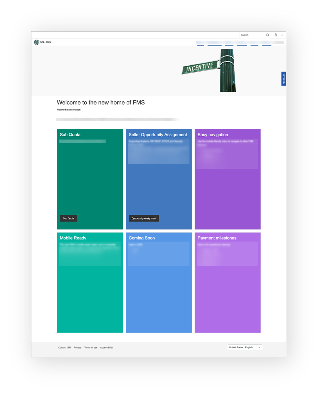
IBM Seller Incentives is one of the most operationally critical internal platforms in IBM's Global Sales Incentives (GSI) ecosystem. The platform is the primary tool sellers and sales managers use to understand incentive structures, track performance against targets, and make compensation-related decisions — at enterprise scale, across every geography IBM operates in.
When I joined in 2020, the platform carried years of accumulated UX debt inherited from its legacy architecture as FMS (Field Management System). Navigation was fragmented, terminology drifted across sections, and key tasks required disproportionate effort — particularly for infrequent users who didn't have the mental model to compensate for unclear IA. Simultaneously, IBM was driving a platform-wide migration from Northstar to Carbon, raising the bar for consistency, accessibility, and interaction quality across all product surfaces.
My Role
I was the embedded Senior Product Designer responsible for the UX/UI layer of the modernization effort. My scope covered the full design cycle: identifying and prioritizing UX debt through structured evaluation, designing Carbon-aligned improvements, running design QA with engineering to validate token usage and component fidelity, and tracking improvement signals through NPS trends and qualitative feedback.
A key part of the role was operating at the intersection of design intent and engineering constraint. The legacy codebase made wholesale redesigns unrealistic — the work required surgical prioritization: identifying the changes that would deliver the most user value within the constraints of what could actually be built and deployed without destabilizing production.
IBM Design Thinking: Hills
We followed IBM Design Thinking methodology, the team aligned on outcome-oriented Hills before committing to any design direction. This framing kept prioritization conversations grounded in user outcomes rather than feature lists or visual polish:

- A seller can understand their incentive structure and current progress without contacting their manager.
- A sales manager can review their team's performance and take action from a single surface.
- An infrequent user can complete a key task on their first try, without relying on prior familiarity.
Signal: NPS as a Design Input
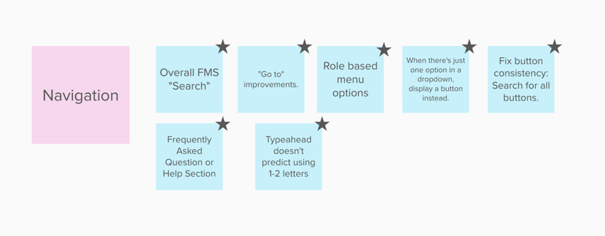
The platform's NPS was deeply negative when I joined — sitting between −10 and −15. Rather than treating NPS as a lagging indicator to improve over time, I used it as a directional signal for where to look. Verbatim feedback consistently surfaced "navigation" and "can't find" as the dominant pain themes. This focused the evaluation: the problem wasn't aesthetics — it was discoverability, wayfinding, and cognitive load.
Method: Heuristic Evaluation
To rapidly surface navigation and usability issues across the platform, I ran a structured
heuristic evaluation — reviewing key user flows against Nielsen's 10 usability heuristics,
calibrated to IBM's specific product context. The evaluation was designed to produce
a shared backlog, not a report: findings were formatted
as actionable items that product owners and engineers could reason about directly,
with severity ratings and proposed solutions attached.
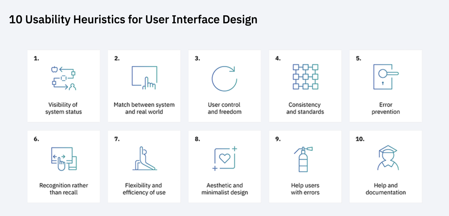
Findings were presented in a Playback session with the full squad — including developers, product owners, and stakeholders — aligning the team on both the problem scope and the prioritization criteria before any design work began.
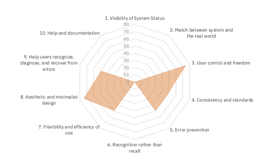
Prioritization: UX Debt Triage
The backlog was extensive. Rather than attempting to address everything, I grouped findings into six categories that mapped cleanly to how the product and engineering team reasoned about work — making prioritization conversations faster and reducing the translation cost between design recommendations and sprint planning:
- UI inconsistencies and legacy components: components not yet migrated to Carbon tokens, visual patterns that created false affordances.
- Content, terminology, and messaging clarity: label drift, inconsistent vocabulary across sections, error messages that described the system instead of guiding the user.
- Information architecture and navigation structure: the highest-impact category; items in unexpected locations, deeply nested paths for frequent tasks.
- Accessibility gaps: contrast failures, missing focus states, form fields without visible labels — all flagged against WCAG 2.1 AA and Carbon's accessibility requirements.
- Customer journey consistency: experience breakpoints where mental models built in one section broke down in another.
- Omnichannel continuity: surfaces where the experience diverged across devices or access contexts without user-facing justification.


Northstar → Carbon: The Migration Strategy
IBM's migration from Northstar (the predecessor design system) to Carbon was not a visual refresh — it was a systematic shift in how design and engineering shared a component vocabulary. Carbon's token-based architecture meant that adopting it correctly required changing not just what components looked like, but how engineers referenced design decisions in code.
My role in the migration included: defining which Northstar patterns had direct Carbon equivalents versus which needed custom adaptation, producing component-level handoff documentation with explicit token references, and running design QA sessions with engineering to verify that Carbon tokens — color, spacing, type — were implemented correctly and not overridden with hardcoded values that would accumulate new debt.

Accessibility
IBM's internal platforms are subject to the same accessibility standards as public-facing products. Carbon DS provides a WCAG 2.1 AA-compliant component foundation — but compliance depends on implementation, not just component selection. During the modernization, I flagged and resolved:
- Contrast failures: text and interactive elements that fell below 4.5:1 ratio in both Northstar-era and transitional components.
- Focus management: modal dialogs and panel overlays that trapped or lost focus, breaking keyboard navigation flows.
- Form label clarity: inputs using placeholder-only labels — a common Northstar pattern that Carbon explicitly moved away from.
- Error state communication: errors surfaced as color changes only, without text or icon support — failing users with color vision deficiencies.
Impact
NPS improved steadily at approximately 5–7 points per month during high-activity iteration periods. The platform moved from one of the lowest-rated experiences in the GSI ecosystem to a positively perceived product — a signal that incremental, evidence-based UX improvements compound into measurable trust over time.
- Navigation friction reduced — key tasks reachable in fewer steps after IA restructuring.
- Carbon adoption enabled consistent, accessible component usage across the platform's primary surfaces.
- Design-to-engineering handoff quality improved through token documentation and design QA, reducing implementation rework.
- Heuristic evaluation output became a reusable framework — the categorization system was adopted by the product team for ongoing backlog triage beyond the initial engagement.
What This Project Actually Demonstrates
This is not a hero redesign. There is no single before/after screen that captures three years of work. What this project demonstrates is a different and arguably harder skill set: the ability to operate effectively inside a large, constrained enterprise system — translating messy user signals into defensible priorities, navigating governance and engineering realities, and delivering consistent incremental improvements that compound into measurable outcomes over time.
IBM platforms don't get rebuilt overnight. They get better — or don't — based on the quality of design judgment applied every sprint, every prioritization meeting, every handoff. That's what this case study is evidence of.
Note on Confidentiality
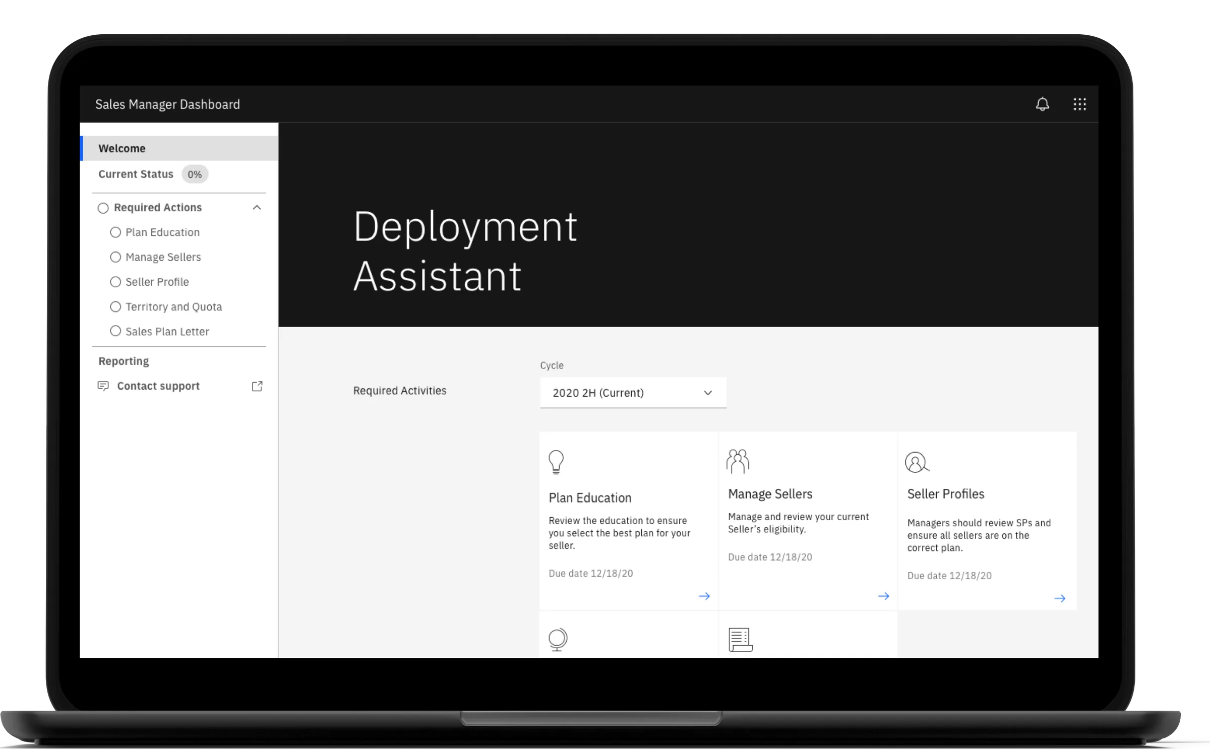
Due to IBM confidentiality requirements, this case study focuses on process, methodology, and outcomes rather than detailed internal screens. Visuals shown are representative artifacts used to communicate the work internally and have been reviewed for public sharing.