Datometry qInsight — Designing the MVP for Cloud Data Warehouse Virtualization
I led UX/UI design for Datometry qInsight — a platform that lets enterprises run applications built for on-premises data warehouses on major cloud data warehouses, without rewriting a single line of code. The Datometry team has since joined Snowflake to bring seamless application interoperability to the AI Data Cloud. This case study covers the design decisions, tradeoffs, and system thinking that made a technically complex platform feel operable — and what I'd do differently today.
At a glance
- Role: Design Lead (UX/UI) — owned MVP experience for cloud data warehouse virtualization.
- Impact: Shipped operational UI for Hyper-Q; Datometry team later joined Snowflake to extend application interoperability.
- Scope: Information architecture, design system, heuristic evaluation, and WCAG-minded patterns for DBA-facing workflows.
Screens reflect representative product patterns; some customer-specific configurations are omitted for confidentiality.
The Problem — Business and User
Business problem: Enterprises have billions invested in applications built for on-premises data warehouses (Teradata, Netezza). Moving to modern cloud warehouses (Snowflake, BigQuery, Redshift) requires rewriting application logic — an effort measured in years and tens of millions of dollars.
Datometry's core product, Hyper-Q, is the virtualization engine that eliminates that cost. qInsight — the product I designed — is the operational UI that made Hyper-Q visible, configurable, and trustworthy: the surface where database administrators monitor query translation, diagnose compatibility issues, and take action.
User problem: Database administrators and platform engineers needed to monitor query translation in real time, diagnose compatibility issues, and take corrective action — on infrastructure they couldn't afford to break. The primary anxiety was: am I seeing everything I need to see before I act? The UI had to answer that question on every screen, for every state.
Why this matters for product goals: An opaque virtualization layer would be rejected by technical buyers regardless of its capabilities. Visibility and control were not UX nice-to-haves — they were the adoption gate. The design directly enabled commercial viability of the product.
Role & Ownership
I was the sole designer on a cross-functional squad. The table below clarifies what I owned individually versus what was collaborative:
| Area | Who | Notes |
|---|---|---|
| Information architecture Me | Solo | Full IA design — navigation structure, page hierarchy, MVP scope decisions |
| Wireframes & prototypes Me | Solo | Low-fi through high-fi; interactive prototypes for stakeholder validation |
| UI system & components Me | Solo | Dashboard patterns, table system, status indicators, error states |
| Handoff documentation Me | Solo | Specs, interaction annotations, spacing/token documentation |
| Domain understanding Shared | With Eng + PO | Data warehousing concepts, virtualization behavior, terminology |
| MVP scope definition Shared | With PO + Eng | I contributed design perspective; final scope decisions were joint |
| User validation Shared | With Stakeholders | Representative users limited; primary validation via stakeholder proxies |
Process Overview
The engagement ran in an Agile model with two-week sprints. Design led engineering by approximately one sprint — producing validated wireframes before implementation began on the corresponding feature. This rhythm prevented the most common failure mode in MVP-speed work: engineering building from ambiguous specs and accumulating UI debt from day one.
- Sprint 0: domain immersion — studied the virtualization layer, query translation pipeline, and where technical failure modes lived. Built a shared glossary with engineering to prevent terminology drift in the UI.
- Discovery: mapped user types (DB admins, platform engineers, technical leads), their primary tasks, and the high-stakes moments where the UI must prevent costly mistakes.
- MVP scoping: prioritized the minimum workflow set that demonstrated end-to-end value — connection setup, query monitoring, issue diagnosis, compatibility reporting.
- Design + validation loops: low-fi wireframes → stakeholder review → high-fi → engineering alignment → implementation → design QA.
Key Design Decisions & Tradeoffs
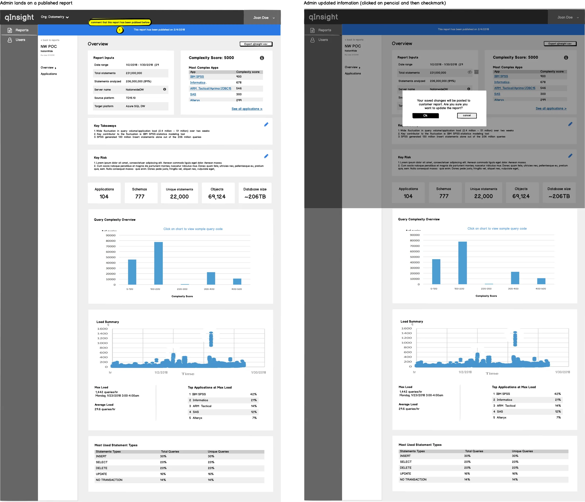
I chose to lead every primary view with system status rather than with actions or navigation. The alternative was a task-oriented layout (common in SaaS tools) prioritizing what users can do. The tradeoff: status-first is slower to reach actions from, but for infrastructure tools, knowing the current state of the system before taking any action is not optional — it's how operators prevent outages. Technical users accepted the extra step; the mental model matched their domain. Stakeholders initially pushed for action-first; I used two prototype comparisons to demonstrate the failure mode where users would take actions on a system in an unknown state.
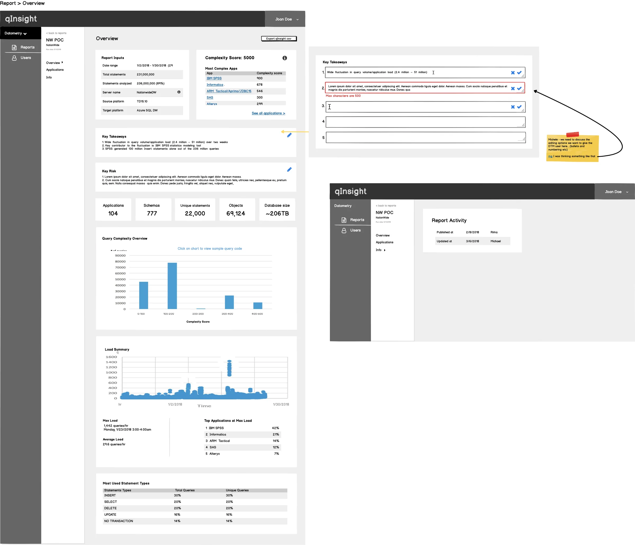
Initial wireframes used modal overlays for query detail views — a common pattern that keeps the list view clean. I moved to an expandable inline panel after testing showed that users needed to reference list context while reading query detail — the modal cut off that comparison. The tradeoff was visual complexity on the page. I managed this with progressive disclosure: detail panels were collapsed by default and the expansion was sticky, preserving the user's position in the list.
There was pressure to simplify technical labels for a broader audience. I advocated for using the system's actual terminology (e.g., "rewrite rules," "dialect translation," "compatibility score") rather than abstracted equivalents. The reasoning: our users were database administrators. Simplified labels would feel patronizing and create a translation burden between the UI and their mental model of the underlying system. Simplification for the wrong audience is not clarity — it's noise.
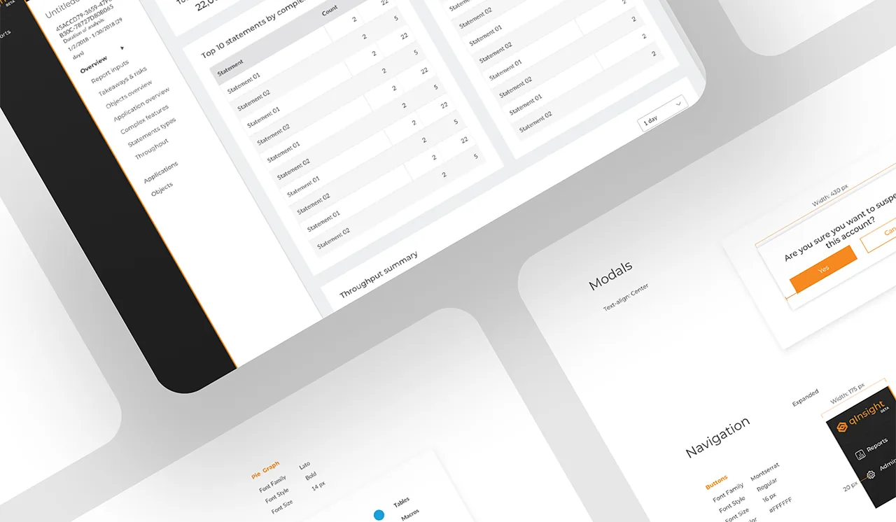
UI Design & Component System
I established the UI foundation as a lightweight component system — not a full design system, but enough standardization that the patterns could be extended consistently by the team without my involvement. The priorities were:
- Scannability over density: enterprise users scan before they read. Every table, card, and panel was designed to expose the most critical signal at a glance — status, count, severity — with detail available on demand.
- Status vocabulary: I designed a four-state status system (healthy, degraded, error, unknown) with color, icon, and text — never color alone — to support color-blind users and monochrome contexts. Applied consistently across all surfaces.
- Safe actions: destructive or irreversible actions required a secondary confirmation step. The pattern was explicit in the component documentation so engineering couldn't inadvertently skip it.
- Empty states as onboarding: every empty state communicated what the user should do next, not just "no data." For a new product with a technical setup process, this was a first-run experience embedded in the UI.
What Didn't Work — Iterations & Learnings
Three design directions failed during the MVP and were revised:
- First IA attempt was too flat. I initially proposed a shallow navigation structure — two levels maximum — to reduce click depth. In testing, users couldn't form a mental model of the system's scope. The product had distinct operational domains (connections, monitoring, analysis, reporting) that needed explicit grouping, not compression. I restructured to a four-domain navigation with clear labeling. The extra level was worth the orientation benefit.
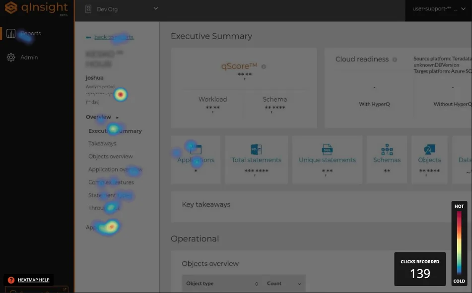
- Heatmap visualization was misleading in its first version. The initial heatmap design used color intensity to represent query volume, which users read as "severity" — a critical misinterpretation. After seeing this in a stakeholder session, I redesigned with explicit scale labels, a neutral-to-accent color ramp (not red/green), and a legend integrated into the header rather than a separate tooltip. Color stopped doing the cognitive work alone.
- Stakeholder validation ≠ user validation. The most significant process learning: we validated against stakeholders who were proxies for users, not actual database administrators in their work context. Decisions that felt validated — especially around terminology and the volume of data surfaced by default — would likely have been challenged by real users with real operational pressure. This was a constraint of the engagement, not a mistake, but it's the biggest gap I'd address if the product matured.
Scalability & Systems Thinking
The component system was designed with extension in mind — even at MVP scale. Three decisions that enabled this:
- Status vocabulary was centralized. Rather than designing status indicators per-screen, I defined a single status token set reused across all surfaces. Adding a new status type required updating one definition, not auditing every screen.
- Table system was parameterized. The table component was built with configurable column density, sort behavior, and action placement — so new data types could be surfaced without a new table design each time.
- Navigation was domain-based, not feature-based. Features grow; domains don't change as often. A navigation built around user domains (monitoring, diagnosis, configuration) can absorb new features without structural redesign.
The system was not a full design system — no token file, no Storybook. For an MVP engagement, that investment wasn't justified. What was justified: enough documentation that engineering could extend the patterns without needing to make new visual decisions. That's the minimum viable design system for a startup context.
Impact & Metrics
The MVP shipped with no critical path errors requiring design rework — the primary measurable signal available for a fast-moving MVP engagement. All three core workflows (connection setup, query monitoring, issue diagnosis) passed stakeholder review in first presentation with no structural redesign requests.
- MVP delivered on schedule — design and engineering moved in parallel without blocking each other, enabled by the one-sprint design lead.
- UI patterns reused across 6+ subsequent features — the table system, status vocabulary, and empty state patterns were extended by engineering without new design input required for each.
- Terminology document adopted by the full team — the shared glossary created during Sprint 0 became the reference for product copy, engineering variable naming, and QA test descriptions.
- Caveat: the absence of direct user research means satisfaction and task completion metrics were not available. The metrics above are delivery quality proxies, not user outcome validation.
- Acquisition signal: Datometry subsequently joined Snowflake — the ultimate external validation that the platform's value proposition was proven at commercial scale.
After the MVP and subsequent iterations, the Datometry team joined Snowflake
to bring their database virtualization technology to the Snowflake AI Data Cloud.
The core value proposition that drove every design decision in qInsight —
enterprises moving from legacy warehouses to modern cloud platforms without rewriting applications —
proved commercially significant enough to attract one of the most valuable data platforms in the industry.
For context: the migration problem qInsight was designed to make visible and manageable is the same one
Snowflake needed to solve at enterprise scale. The product found its ultimate expression not as a standalone tool,
but as a capability embedded into a platform that serves the world's largest data organizations.
That trajectory — from MVP to enterprise acquisition — is the clearest possible validation that
the problem was real, the solution worked, and the design was part of what made it trustworthy enough to operate.
What I Would Improve
- Run a formal heuristic evaluation mid-MVP: I relied on stakeholder sessions and intuition to catch usability issues. A structured heuristic review — logged, severity-rated, and shared with the squad — would have produced a defensible backlog rather than tribal knowledge about what needed fixing.
- Add direct user research before finalizing the IA: even 5 contextual interviews with actual database administrators would have challenged assumptions about terminology and default data density. The personas I built were stakeholder-informed, not user-validated. That gap matters for a product where expert users have very specific mental models about how infrastructure tools should communicate state.
- Document accessibility as a named requirement from Sprint 0: WCAG 2.1 AA compliance was an implicit design principle, not a tracked requirement. On an enterprise platform where teams include users with varying visual acuity and keyboard dependency, it should have been a formal acceptance criterion with a named owner.
- Instrument from day one: define success metrics before launch — task completion rates per workflow, time-on-screen for key status views, error recovery rates — so the first week of data generates design signal rather than retrospective guesswork. This was available to us and we didn't set it up.
- Raise the visual craft bar on status and loading states: the UI made complex infrastructure legible — the right priority for an MVP. The next iteration would invest in micro-interaction quality: transition timing on status updates, animation on data loading that communicates system activity without creating anxiety, and tighter typographic progression across the density spectrum.